Cryptocurrencies: 852,581
Exchanges: 1,065
Market Cap: $2,485,576,043,866
24h Vol: $98,768,860,670
BTC Dominance: 50.74%
ETH Gas: 12 Gwei

How to Read Forex Charts?
Most of the investors these days are attracted to the forex trading world as it helps them to make higher profits in lesser time. But to make money through this channel, it is first essential to understand chart movements of currency pairs in the market.
Some experienced traders in the forex trading prefer to develop their strategies for investment by focusing on interest rates, news, and the economic variables as well.
However, others are more concerned about charting tools and a particular type of indicators to make potential trading decisions.
Well, no matter what kind of trading method you use, knowledge about forex charts is always essential to ensure precise outcomes. If you are a beginner, we have created this detailed guide for you to collect all the necessary information about forex charts and methods to read them.
What is a Forex Chart?
You might be eager to learn the meaning of the forex chart. First of all, Forex here means Foreign Exchange- a market, where people keep on buying and selling a wide range of currency pairs to obtain profits.
The global foreign exchange market is controlled by investors, retailers, institutions, and speculators that help to decide the relative value for conversion from one currency pair to another during sale or purchase. Forex is widely popular as a liquid and dynamic marketplace, where daily turnover is observed to be much more than 5.3 trillion dollars.
Now, the forex chart can be described as a graphical depiction of the currency exchange rate. The charts present a visual display for how much the currency pairs have varied over time. It is possible to plot forex charts for a variety of currency pairs. Depending upon your trades, you can get analysis for GBP/USD, EUR/USD, NZD/JPY, AUD/CAD, and many more. Traders make use of forex charts to understand the market values of particular trade pairs so that they can ensure profits for their investments.
How do Forex Chart Timeframes Work?
The forex charts display data in terms of timeframes, where the trader himself can decide the display range. By default, these charts use to follow the daily (1D) timeframes. It means that every point on the graph, whether it is a bar, candle, or line, it represents trading data just for one day.
In case if traders charge this daily time frame to 60 minutes timeframe, the Forex chart will display data worth 60 minutes. Traders can make his own decisions about how long data he needs to analyze and can make settings on the charts accordingly. It is possible to set the timeframe as low as up to 1 minute or as high as up to one month. However, some Forex charting software tools provide much-advanced options for timeframe selections.
Types of Forex Charts
Now, let us discuss some points about different types of charts in the Forex Trading world.
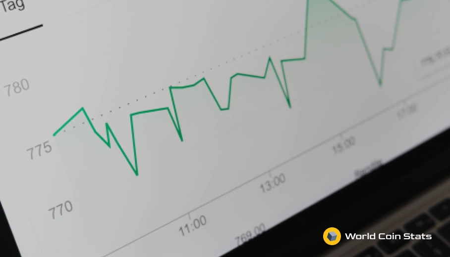
Line Charts:
These charts are the most basic type of charts in Forex Trading, where a simple line helps to depict the variation from one closing price to the other closing price of the selected currency pair. When corded together with some line, these charts can display the global price movements over a specific period. Traders can make settings for the type of currency pair that they are interested in following.
Bar Charts:
This type of chart is more advanced than the line charts, where information about currency pairs is not limited to opening or closing price; instead, bar charts include the highs and lows as well. The bottom part of the bar chart provides information about the lowest traded price over a specific time, whereas the top part of the chart indicates the highest price.
Traders will also find a vertical bar that indicates the trading range of the selected currency pair as a whole. Furthermore, the horizontal hash, located on the left side, determines the opening price, whereas the horizontal hash on the right side displays the closing price.
A bar chart describes a one-time segment, where the trader can make range selection as one hour, one week, one day, etc. Some experts also refer to bar charts as OHLC charts as they represent Open, High, Low, and Close values for the currency pairs.
Candlestick Charts:
These charts display almost the same price information as that of a bar chart, but the representation is much cleaner with the set graphics format. The candlestick bars make use of a vertical line to indicate high to low range for currency pair. Also, the more massive block in the middle of the chart describes the opening and closing price range.
When the selected currency pair closes at the lower value as compared to its opening value, the middle block appears colored; whereas if the closing price goes higher as compared to the opening price, the block appears unfilled or hollow. Some software tools also give them black and white colors, respectively, or even a few other color combinations as well.
The most significant advantage of candlestick charts is that even beginners find them easier to interpret.
Depending on your expertise and knowledge, you can use any of these charts to analyze the currency pair values in the market.
Conclusion:
Hopefully, this article provided you all the necessary information about Forex Charts and their price movements. If you are a beginner in the trading world, it is beneficial to consider expert opinions about the selection of a charting tool so that you can make a more appropriate market analysis without mistakes.
Once you have learned the basics of charting mechanism and selected the right kind of tool for currency pair analysis, it may become much easier to understand the market potential at any time. As a result, you can find ways to make easier decisions for investment.
Related Articles
The 3 Best Penny Stock Brokers of 2019
Do you want to know which are the best three penny stock brokers this year? Investing in penny stocks comes with many risks. However, regardless...

Deeper Pullback is Expected, Millionaire Bitcoin Trader Says
Zoran Kole, a millionaire bitcoin trader, stated that a 5 percent drop is expected overnight, and dominant cryptocurrency bottom isn’t in yet. On the 8th...

Trade War Opens Opportunity for Chinese to Win Over the Middle East, Africa
BEIJING, CHINA – One of the largest economies in the world, China, is now having the advantage of influencing the Middle East and Africa into...